LAST UPDATED 4 years, 2 months ago
Intro
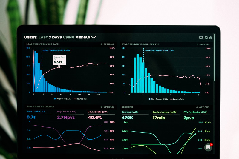
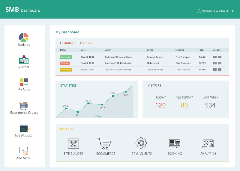
Dashboards are, at their simplest, a chart or group of charts representing some evolving data, updating as the data changes in real-time. They are a tool of convenience, meaning they should be easy to interpret and always save the user time. When developing dashboards, simplicity and user-friendliness should always be among the top priorities. Dashboards are an essential tool for analytics and business intelligence. The perfect dashboard answers well-defined business questions visually, and therefore can only be the fruit of collaboration between the developer and the business client. This article summarizes the best practices and guidelines for building a dashboard for developers and business clients alike.
1 - Start by defining your relevant key performance metrics
Dashboards are tools to solve and monitor key performance metrics (KPI) of your business application. KPIs can be thought of as the vitals of an operation, be it in marketing, or human resources, or manufacturing/production.2 - Follow the KISS rule (keep it simple, stupid!)
It can be tempting to include every graph under the sun in your dashboard, but too much information defeats the purpose of the concept of data visualization. The goal of dashboards is to facilitate the comprehension of trends in large data populations quickly. They are not meant to be comprehensive documents.3 - Color-coding is your friend
Start by choosing a color palette for your dashboard, then assign each color to a metric, or group of metrics. The idea is that, with practice, the user will eventually be able to identify each performance indicator by just looking at their color. Do NOT break your color convention or you could end up with some very dissatisfied users.
4 - Truncate large values
Users can in general only meaningfully process the first 3 or 4 digits of a number along with their order of magnitude. There’s no need to clutter the graphics with large amounts of digits. If, for example, your metric is 3,423,567 units large, 3.4M will do.5 - Be consistent in your naming conventions
You will, most of the time, need short names for your metrics, and therefore naming conventions. If, for example, your factory produces several types of footwear like sandals, sneakers, and boots, in several colors, your metric for a subtype can be named according to a convention like [color]_[type]_[size], or [type]_[size]_[color], and all names should follow that convention. If your naming format is [type]_[color]_[size], then boot_brown_11 is a valid name, but brown_boot_11 breaks the convention.6 - Don’t overcrowd
It’s understandable that you may end up needing to track several metrics, but it is no reason for overcrowding. Dashboards should be comfortable to look at. Your user shouldn’t have to squint when looking at them. If you have more graphs and metrics than you can comfortably fit in one screen, create tabs, or several screens. This brings us to the next point.7 - Be aware of where your dashboard will be displayed
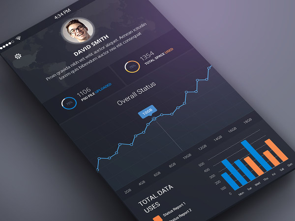
Will your dashboard typically be mostly viewed on large screens? On laptops? Smartphones? Maybe all of them? You need to keep that in mind when designing it. What’s comfortably viewed on a desktop screen can be impossible to view on a smartphone. Web-based dashboards can be made responsive, meaning viewable on every screen size, but that comes at a trade-off too. The display type also affects which colors to use. If for example, your dashboard will be displayed on a wall to be viewed by passers-by, your colors should be bright, saturated, with good contrast. If your dashboard will be mainly viewed on desktops, pastel, medium brightness colors are sometimes more comfortable to look at for a prolonged time.
8 - Integrate interactivity
Any serious dashboard should allow the user to dig deeper into the details by integrating widgets to filter by time interval or demographic segment such as age or gender for example. More generally, every predictor/dimension should be viewable and filterable.9 - Select your charts wisely
The two most important factors about a chart are how intuitive it is, and how accurately can it be visually gauged. There are countless types of charts available, and more of them are being invented every year, but there are only two that have stood the test of time and are head and shoulders above the crowd when it comes to practicality: bar charts and line plots. When it comes to static data visualizations, one can pick and choose which visualization conveys the trends best and include it in a presentation or report, but dashboards with real-time data, meaning they have to be visually meaning full all the time. Pie charts are not visually accurate and therefore should be used sparingly. Virtually all other types are only to be used if an excellent case is made for them.10 - Be mindful of negative space
Negative space, or white space, is the blank space in your dashboard. It plays a vital role in the legibility of your document. Our mind always processes images by grouping features and elements, and the job of the developer is making that process painless for the dashboard user. Each element, and a group of elements, should have sufficient margin around them to stick out.
